
Sean Mickalitis
Contributing Writer
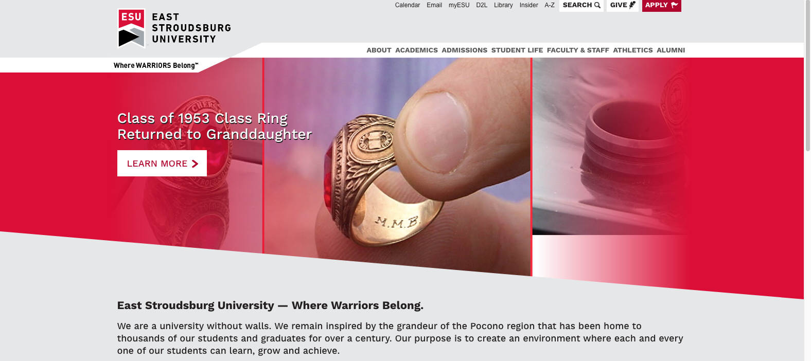
If you have been on ESU’s website recently, you may have noticed some changes.
Last month, the university updated the appearance of its home page from a black, white, red and bold layout to one that is sleek, silver and visually appealing.
The redesign of the home page mimics the changes made to D2L last spring semester, where not only the appearance of D2L changed but also the layout and functionality.
Many students were not happy with the modifications on the D2L website.
I like the new home page, but I prefer the color scheme of the old page.
I was curious to what others thought of the revamped page, so, I went around the university and spoke to a crowd of students.

“I like it. It feels more indifferent, but I don’t see a need for a change,” said Senior Richard Frederick.
“I say in certain cases changes like that are just aesthetic.
There wasn’t a need for it, but the changes were needed to the university.”
He also stated that ESU should have updated and redesigned myESU.
The web portal where students can check their class schedule, order books, pay their bill and more.
According to Frederick, myESU looks outdated. I, along with many students, can agree with that.
Freshman Austin Vongdara had similar views about the new home page.
“I feel the new home page is great for younger students or freshman because it’s easy to navigate,” he said.
“The older website was more difficult to [use], the new layout is user-friendly.”
According to Brenda Friday, director of university relation the last redesign of the ESU website happened in 2012.
“When we began the institutional rebranding process back in 2015, we recognized that this was the best time to redesign and improve our website,” Friday said.
She explained that there are additional changes, beyond what eye can see.
The redesigned website will be mobile friendly, accessible for people with disabilities, coherent and easier for university employees to update their information.
According to Friday, the redesign of the website is a part of a $250,000 per year marketing and rebranding campaign, which began in 2015 and is now in the final stages of implementation.
Currently, only the home page has updated, but Friday explains there are still at least 1,500 pages that will be revised to match the appearance of the home page.
The transition will be complete by the end of the academic year.
Whether you like the updated ESU home page or not, it’s here to stay.
As the new web pages are published, students will come to experience a new, easier to use website tailored for simplicity and convenience.
To see the website yourself, visit esu.edu.
Email Sean at:
smickaliti@live.esu.edu