
Adam Capotorto
Staff Writer
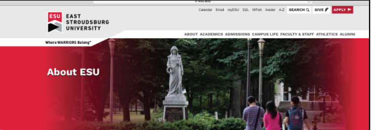
As far as university websites go, we have to have one of the blandest ones.
Functionally, I have no complaints with ESU’s website, its simple, it’s easy to navigate, and it has all the information you need appropriately labeled within its tabs.
Need information on a major? It’s right there.
Need hours for the library? There’s a whole tab just for that.
Want to know more about the faculty and staff? It’s right on the website.
The navigation for the website is rock solid, absolutely foolproof.

Admittedly, it does take some time to find certain things due to just how many resources are listed and sometimes links are within other links.
However, you can almost always find what you’re looking for in a correlated tab. The site is extremely user-friendly.
But, it’s so boring.
Each tab consists of a singular banner photo that you scroll past and then it’s just text with a few tiny pictures cropped to the left of the words.
Honestly, I could probably slap some pictures around on a PowerPoint, scribble some facts and links next to them, and have the same amount of creative design put into it as ESU has for their own website, if not more.
I’ve looked at multiple colleges websites like the University of Scranton, Bloomsburg, Northampton Community College, West Virginia University, Drexel, and many more.
And I can say, with absolute certainty that our school has the absolute most generic website of them all.
Almost every other university has an interactive website, whether through the use of scrolling background images, vibrant colors, or animated links, other universities make it easy to be interested in what they have to offer.
Meanwhile, ESU’s website sort of just exists. It’s really plain, and it doesn’t really make anyone want to spend more time on it than they need to.
It’s a real shame too because there are some really good pictures used on our website but they’re stuck to just being banners.
Plus, all the links are just listed on a white background.
A lot of people complain that they can’t find what they’re looking for specifically for this reason.
Everything just blends into one another. As I said before, everything is where it should be and you can find it, however, its infuriating when you have to read the long list of links two or three times over because you keep glancing over what you’re looking for.
All that needs to be done is to liven the themes of each tab up.
Navigationally, ESU’s website gets a ten out of ten but when it comes to making what you’re looking for obviously noticeable, it’s hard to say it would even get a five.
Part of a good website is to make it grab attention. ESU needs to go back and look into ways to do that.
Email Adam at:
acapotorto@live.esu.edu